Whether you’re looking to do a minor upgrade to your bedroom walls, or have a drastic change these colors might get your creative side moving in the right direction, we’ve seen people put the brush to the wall and completely transform how their room feels.
We thought this selection can give you some inspiration.
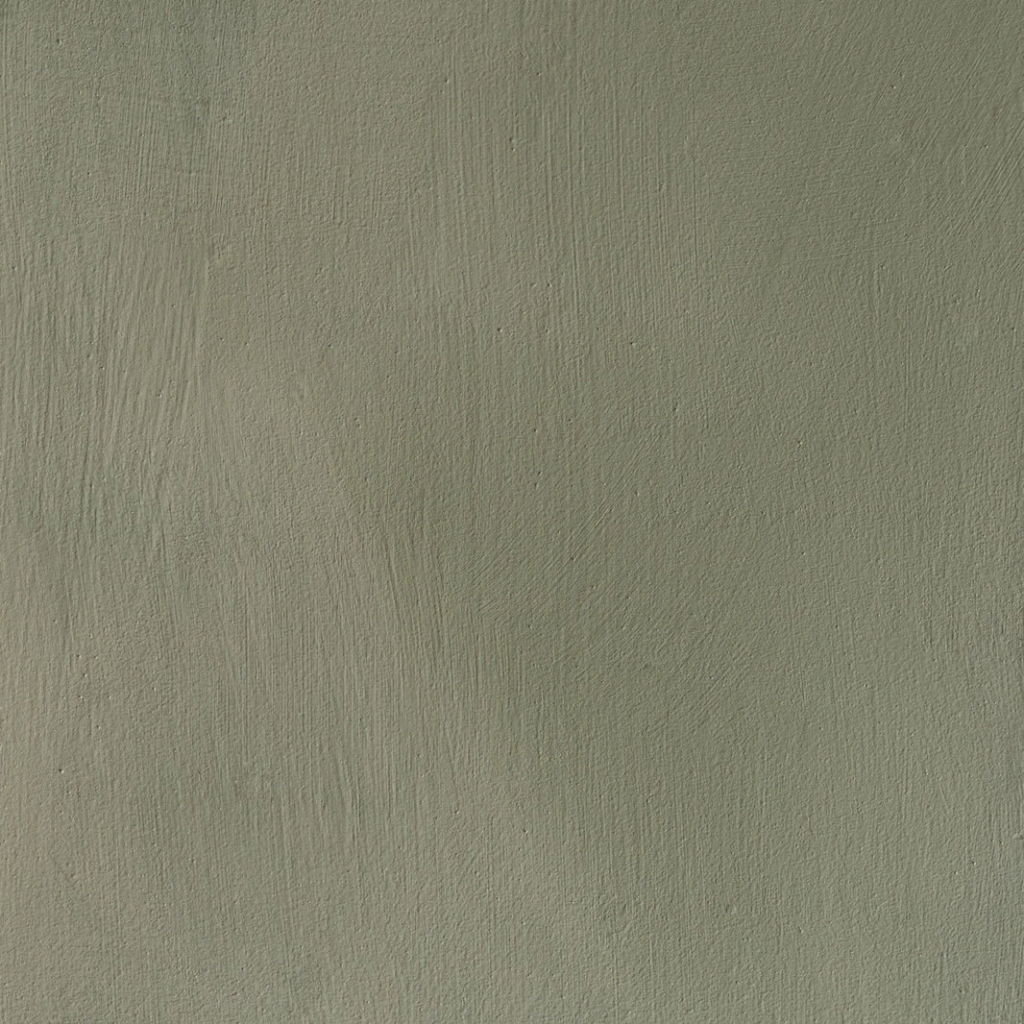
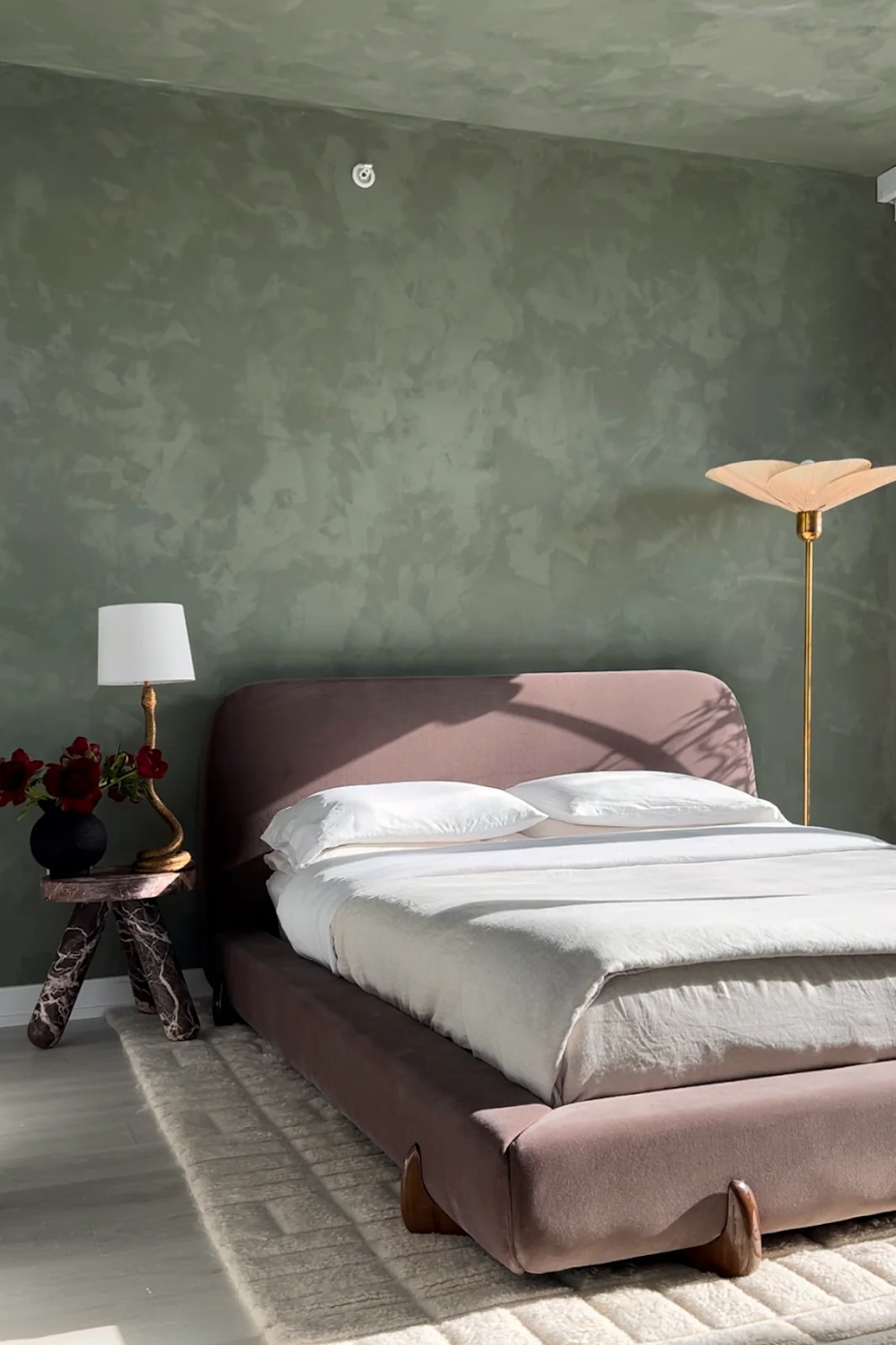
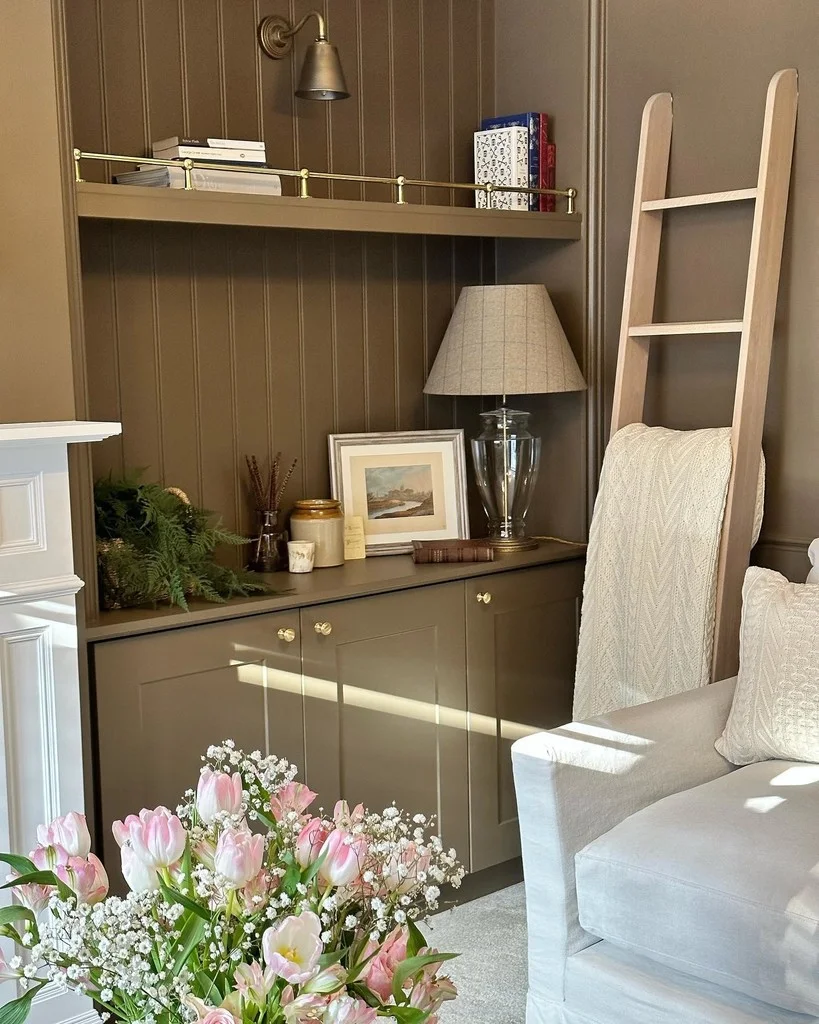
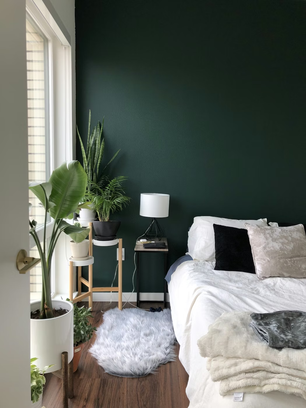
1-Warm Mossy Olive Green
This textured color is understatedly sophisticated, the way it dries, it gives this natural-feel patina that makes you feel relaxed, especially when natural light is cast upon it.
Portola Paints Lime Wash is organic, eco-friendly with zero VOCs!, this makes it highly breathable, also it’s perfect for all kind of surfaces including dry wall.
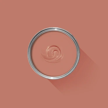
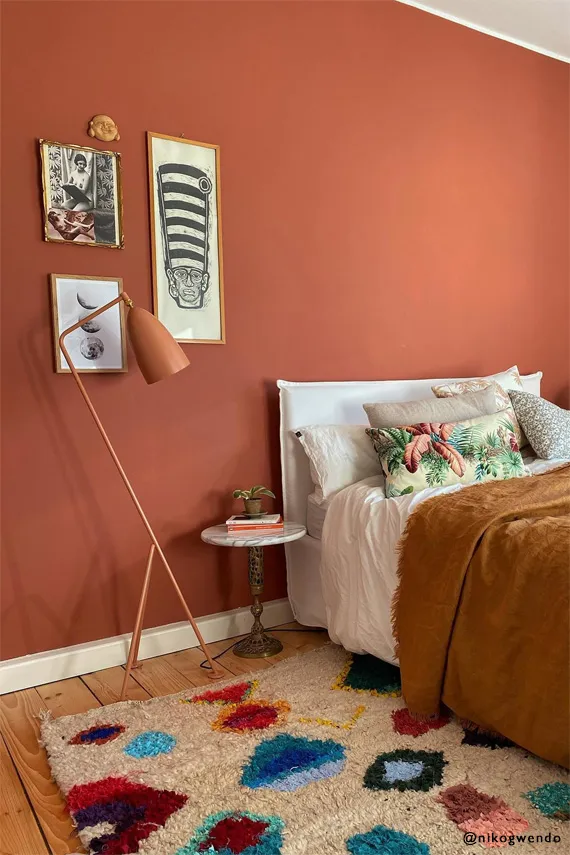
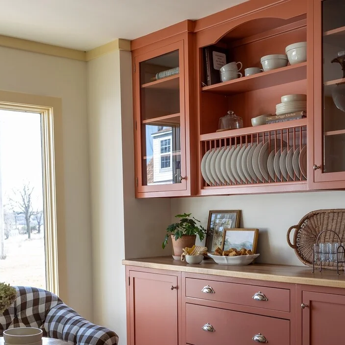
2-Warm Terracotta Red
Well, reds are not easy to pull off, choosing the right shade and texture is often what separates a good end result from your wall resembling a stop sign.
This Farrow&Ball Red Earth no64 is rich and warm, it’s perfect for small spaces, and works great with whites and a wide range of colors, so if you don’t paint a full room with it you can use it for doors, windows or small parts
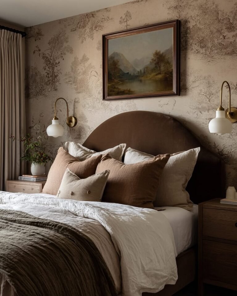
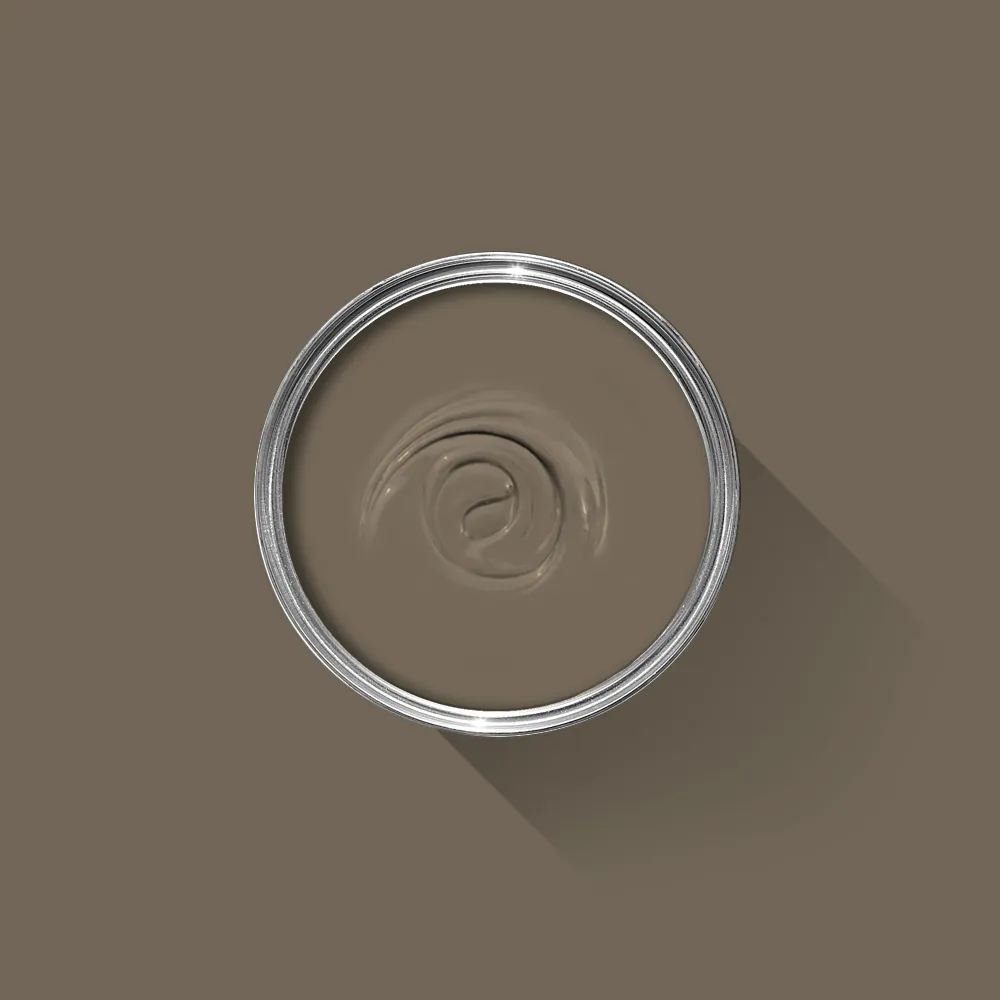
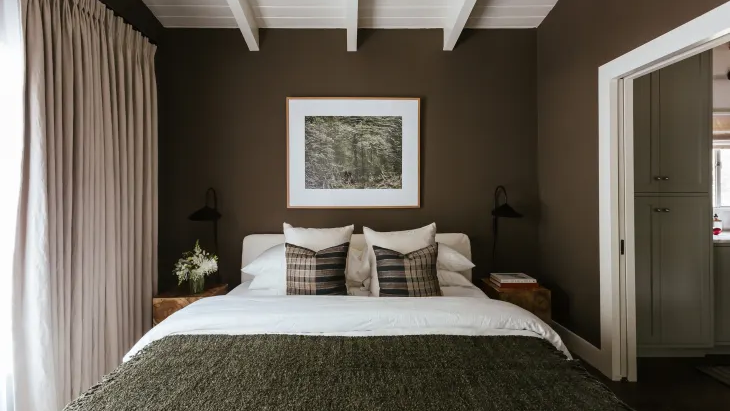
3-Deep chocolate brown
For those looking to create that cozy snugly feel in their bedroom, deep colors will definitely be ideal, they invoke a sense of serenity and calm.
This bedroom for example looks perfect for a hot chocolate laydown in a cold evening, hence the name deep chocolate brown.
Farrow&Ball’ Salon Drab is a modern way to get a 19th century look, it’s deep and rich, versatile for a wide range of applications as they’re different finishes that suit any need, same as their other colors it’s washable and wipeable.
Sentimental Reasons is a lighter brown that I also like from Backdrop home.
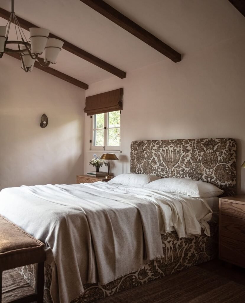
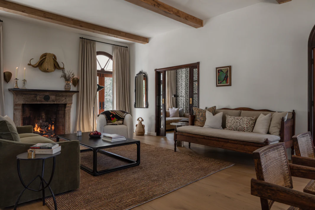
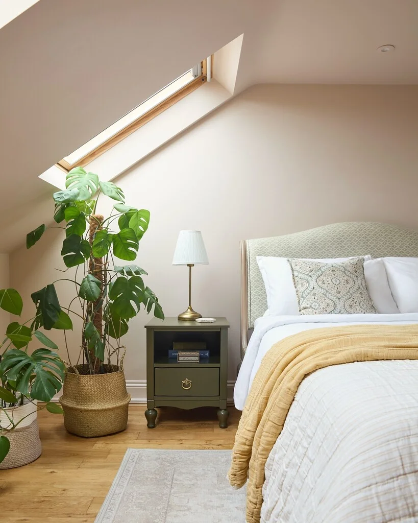
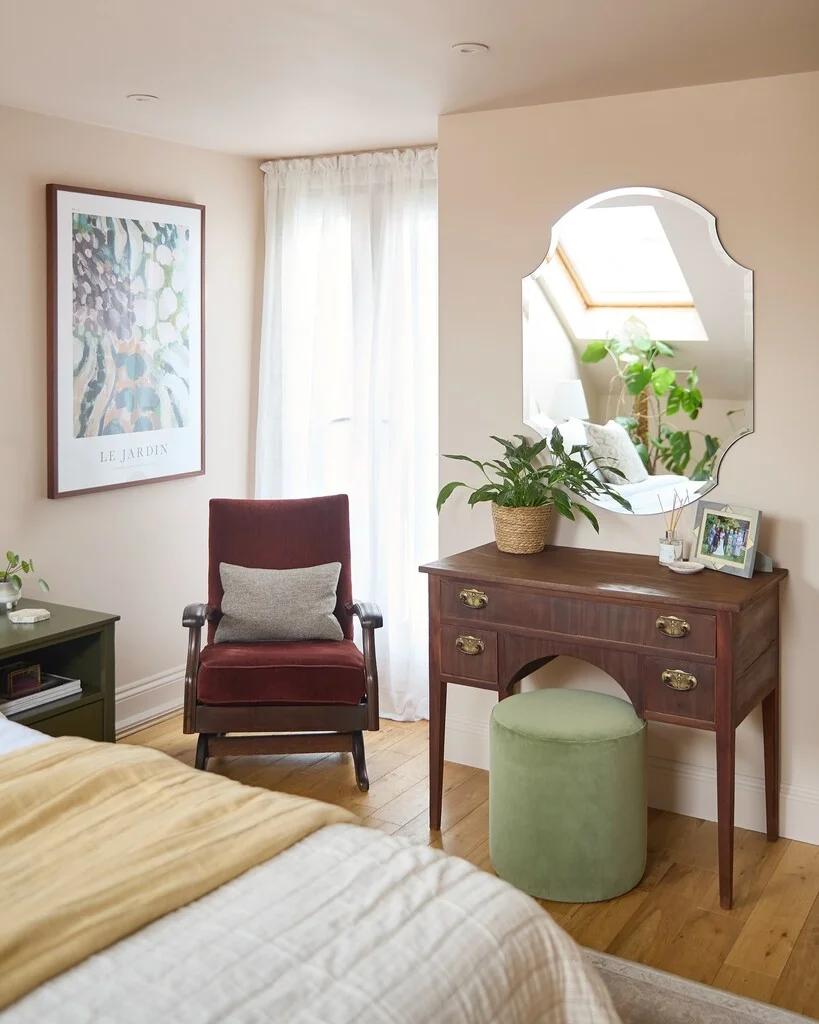
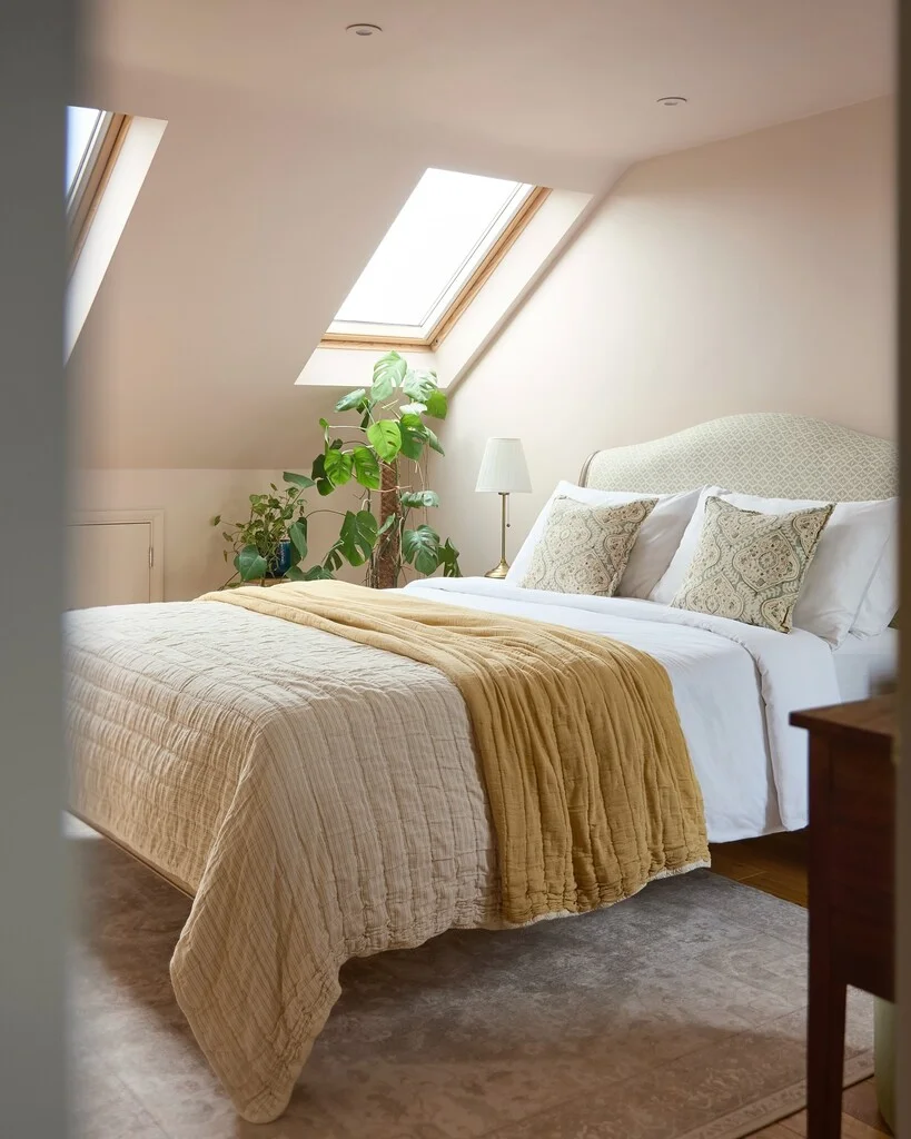
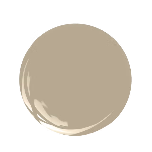
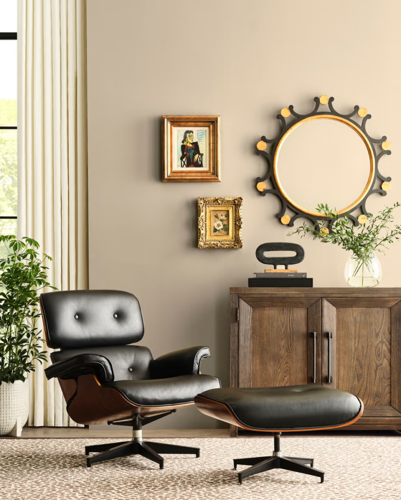
4-Cool or Warm off white
It’s quite clear that the off white compliments wood amazingly, it’s simple and airy, calm and inviting, even though that headboard fabric adds depth to the room, the paint made it stand out even more.
Elizabeth I (Living Room below) is cool Roman Clay off white from Portola Paints they have Mariposa which is more on the warmer side, Farrow&Ball have the School House white which is more on the warmer side and the closest one I found to the paint in the right picture, and they have great white has a hint of lilac and it’s a lovely off white color as well.

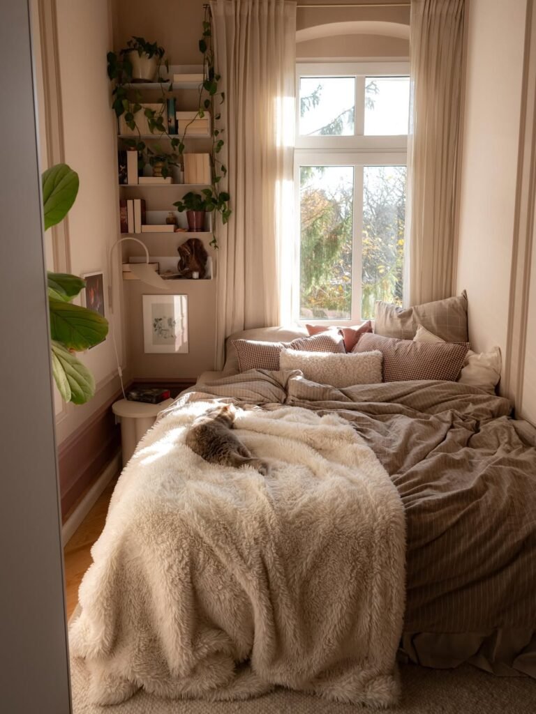
5-Softer salmon hue
I just love how this blush pink color sits on the wall beside the window, even with that ample natural light it softens it in a pleasant way miking the room feel more inviting and gentle, it’s subtle enough so it doesn’t compete with other colors in the room, instead it highlights them making everything look cohesive.
It’s called Scallop from Farrow&Ball, Benjamin Moore’ First light is similar.
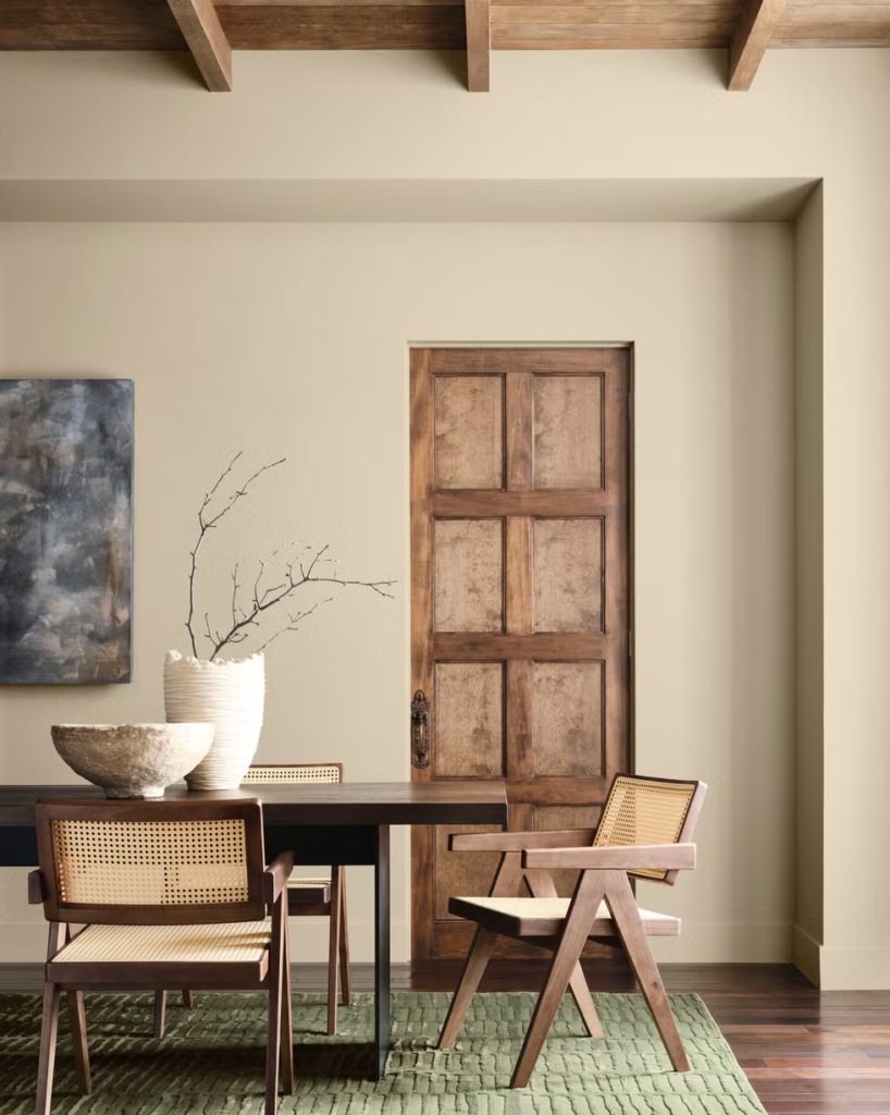
6-Universal Khaki
Announced a few months back as 2026 color of the year by Sherwin-Williams and HGTV Home, Universal Khaki earthy light tan color brings a sense of belonging and authenticity, it’s simple, cozy and warm.
According to Sue Wadden, director of color marketing at Sherwin-Williams, this choice came from the shift to a more lasting living style, where people can feel their living style comes from their identity and not just a passing trend. “Universal Khaki stood out because of its timeless, essential quality. It’s a foundational neutral that feels pared back yet endlessly adaptable.” Wadden Said. And I agree, this color makes me feel nostalgic and yet it’s modern, especially if there are plenty of natural materials and elements.
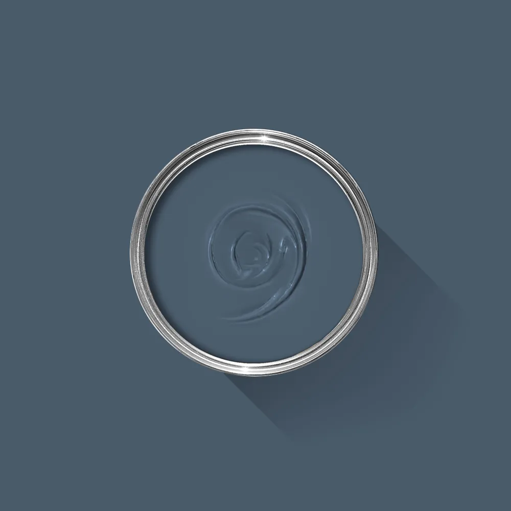
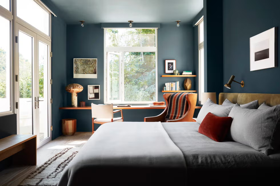
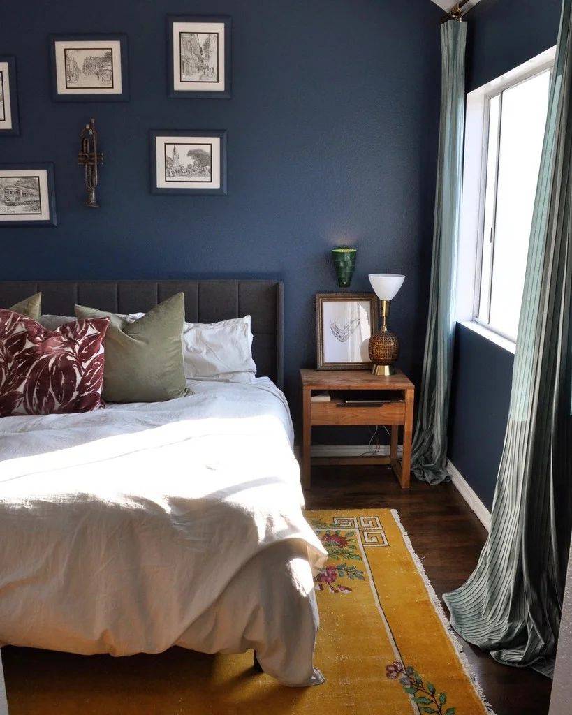
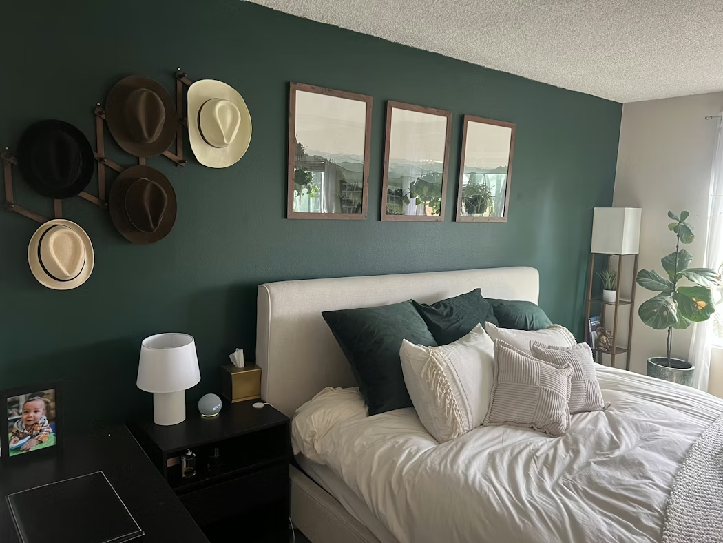
7-Stiffkey Blue
Back to dark colors with this contemporary blue, it’s a calming color yet it can spark creativity, that’s why it works perfectly in this room since it’s a bedroom and an office, the owner wanted a multi purpose color and his choice paid off in a great way.
It can also be used in a wide range of areas, living rooms, bathrooms, stunning on cabinets with brass hardware, so if you’re looking for a color that’s calm but can be uplifting this one is worth a consideration.
Stiffkey Blue from Farrow&Ball.
8-Gray Owl
There’s a reason why this is one of Benjamin Moore’s best selling colors for years, people love it and for so many reasons. It’s a beautiful, versatile, light gray with cool or warm undertones, depending on the lighting situation it can show a slight green or blue.
It compliment other colors beautifully, Pro’s and DIY enthusiasts have used it for every part of the home not just bedrooms ( haven’t seen it in the basement yet ), so if you’re searching for a light gray you can put this one on your under serious consideration, but not without also looking at Repose Gray from sherwin-williams.
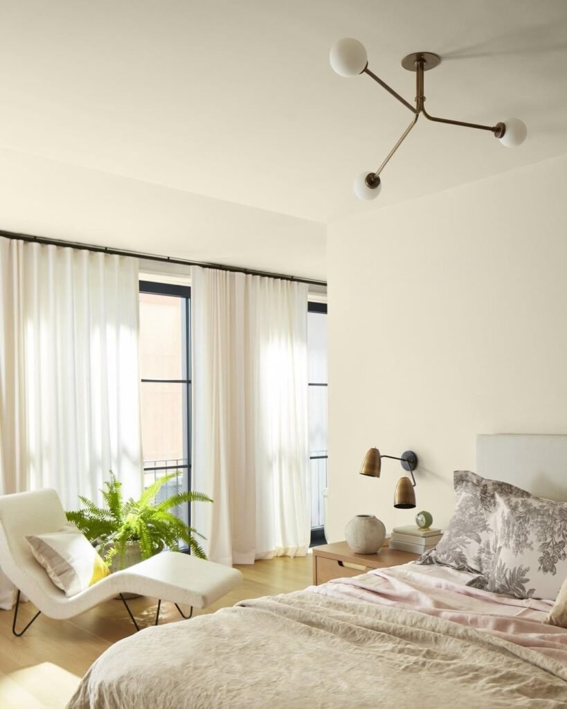
9- Spring in Aspen
Spring in Aspen from Benjamin Moore is a warm, gentle bisque-toned creamy white that instantly makes a space feel relaxed and welcoming. Its soft undertones add depth without reading too yellow or too stark, giving walls a cozy, lived-in warmth. In bedrooms, this kind of creamy white works especially well because it creates a calm, soothing backdrop that reflects light beautifully while still feeling intimate — the perfect balance for a space meant to rest and unwind.
10-Sea Salt
As the name suggests, this muted green from Sherwin-Williams is breezy, looks fresh, and gives a serene feeling to the room, especially when there’s ample natural light like the one bellow, the
white trims will let it stand out even more, I should mention that it has a blue undertone to it may look more blue than green to some.
11-Kismet
This dark dutch green from Backdrop has been used in every corners of the house, bedrooms, bathrooms, windows and doors, and even floors, its deep and rich, looks sophisticated and seem to elevate the space yet it feels calm, what I like is that it works very well with wood, leather, brass and other types of metals.
“ It such a beautiful rich green that looks great in daylight and at night” s review from a customer reads.
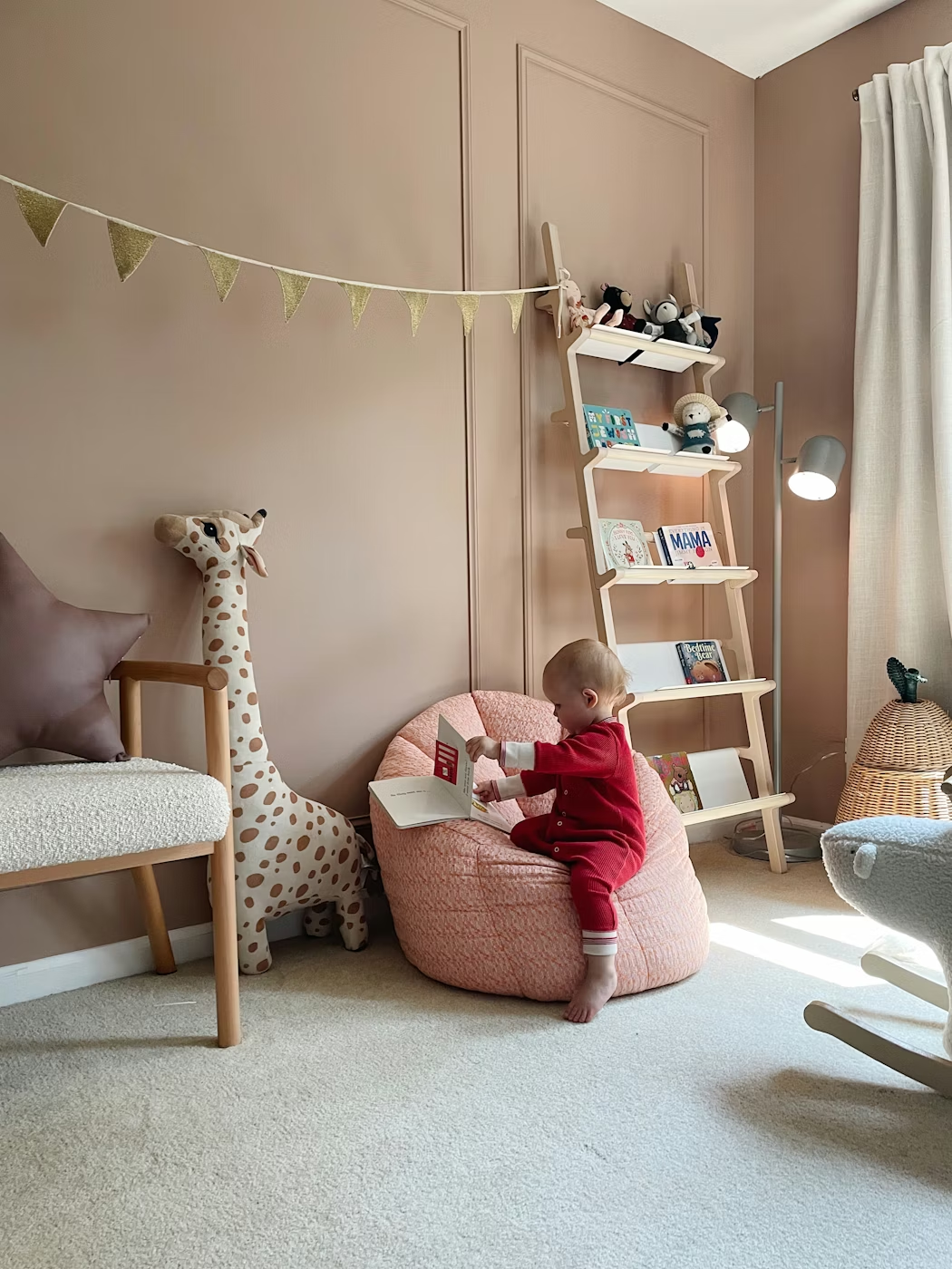
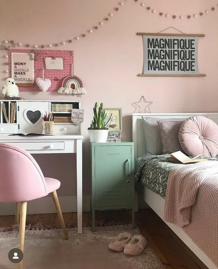
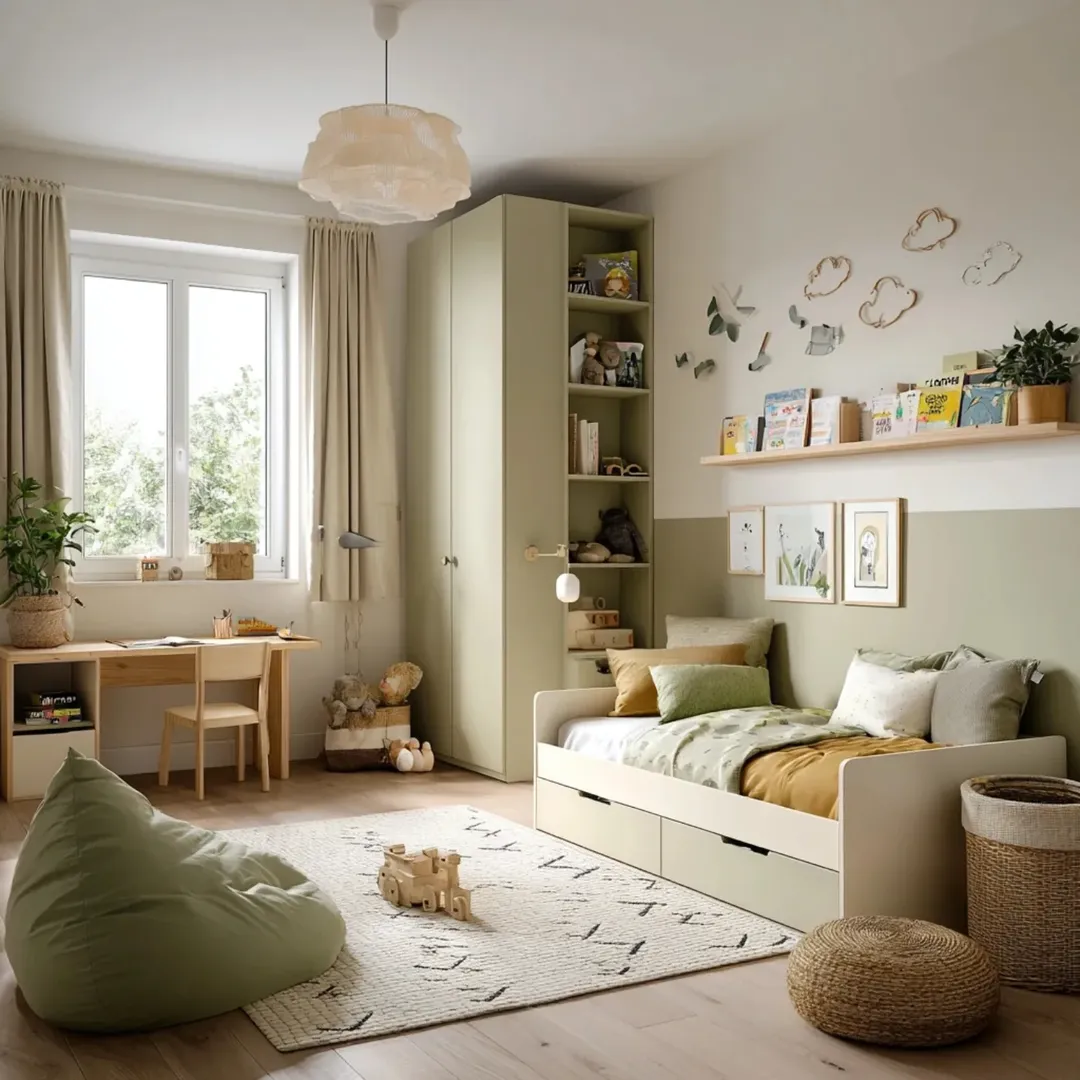
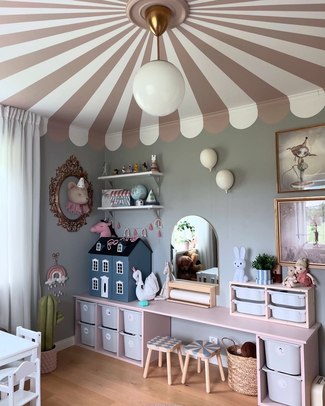
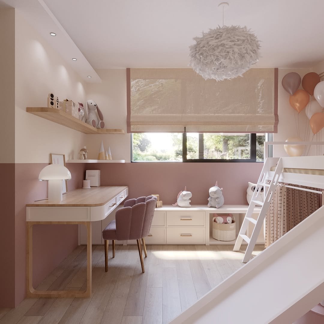
12-Kids Bedrooms
Studio Hours
It’s from BACKDROP they call it warm Taupe, it’s very calming pinkish color which makes it suitable for Kids rooms and nurseries, beautiful.
Calamine
A lovely delicate pink color from Farrow&Ball, it’s a popular choice not just for children’s bedrooms, many people have used it for bedrooms and offices as well, and they always seem to be ecstatic by the result.
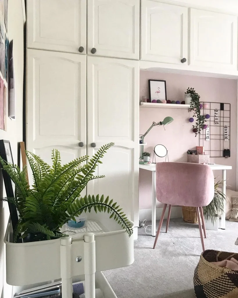
Monochromatic or Complimentary combination
You can create a cohesive, calming base while still feeling playful and fun. Using shades of one color or a well-balanced color pairing keeps the space visually organized, making it easier to layer in toys, books, and artwork without overwhelming the room. These schemes also grow well with kids, offering flexibility to update the room over time without needing a full repaint.
Tips From The Experts
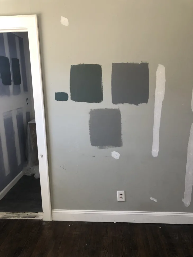
Put the paint to the wall (if you can):
I’ve read from many experts and people who were painting for the 1st time that they chose their best paint color by painting an area in the wall with their top two or three choices and seeing how they feel about them after couple of days, you’ll know how each color reacts to different lighting situations in your house.
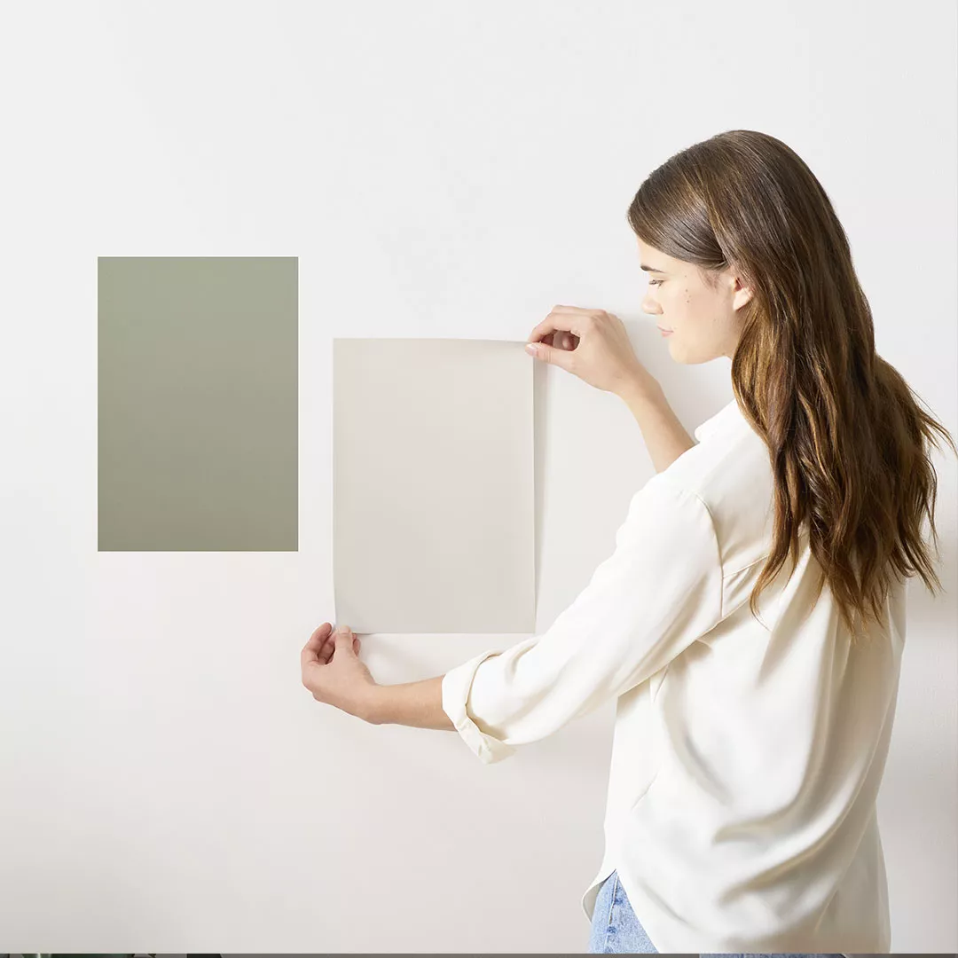
Use Sticky sheets:
if you don’t know what these are, basically you can order 8×8” sheets with your favorite colors then stick them to different walls and surfaces, this is best if you’re not sure you’ll start painting right away, Benjamin Moore and Sherwin-Williams have them, or samplize.com they have Farrow & Ball as well.
Similarly, if the brand you chose doesn’t have them you can get a transparent matt sticky paper from amazon, after you paint it’ll be like the pre-made ones.
Check Color’s LRV (Light Reflection Value) :
if your house or apartment doesn’t get a lot of natural light, and you’re searching for colors that reflect as much light as possible, this metric is your friend. The higher the LRV the more light that paint will reflect, you will find it on most websites under details.
You can read this detailed article to learn more.
For Kids Bedrooms:
you might want to ask about the paint durability, Sherwin-William for example have the SuperPaint line which should be more resistant to scratching.
Thanks for reading, hopefully you found it helpful and if you have anything to add please leave a comment below.