If you’ve spent more than five minutes scrolling through interior design mood boards, you’ve likely seen it: Benjamin Moore’s Swiss Coffee. It’s the color equivalent of your favorite worn-in linen shirt—effortless, high-quality, and a perfect fit for just about any room.
But what makes this specific creamy white the industry’s go-to? We’ve broken down the design logic behind why this shade is the ultimate “safety net” for anyone looking to warm up their home without going full-on beige.
*All Pictures featured in this article are 100% real, we don not use AI images in any of our articles.
It’s a Total Chameleon
The magic of Swiss Coffee paint is its ability to play nice in almost any environment. Unlike some whites that can feel surgical or “cold gallery,” this shade brings a welcoming, lived-in energy.
- The Soft Touch: This is a “welcoming white” that flatters nearly any room, reading as soft and inviting rather than stark.
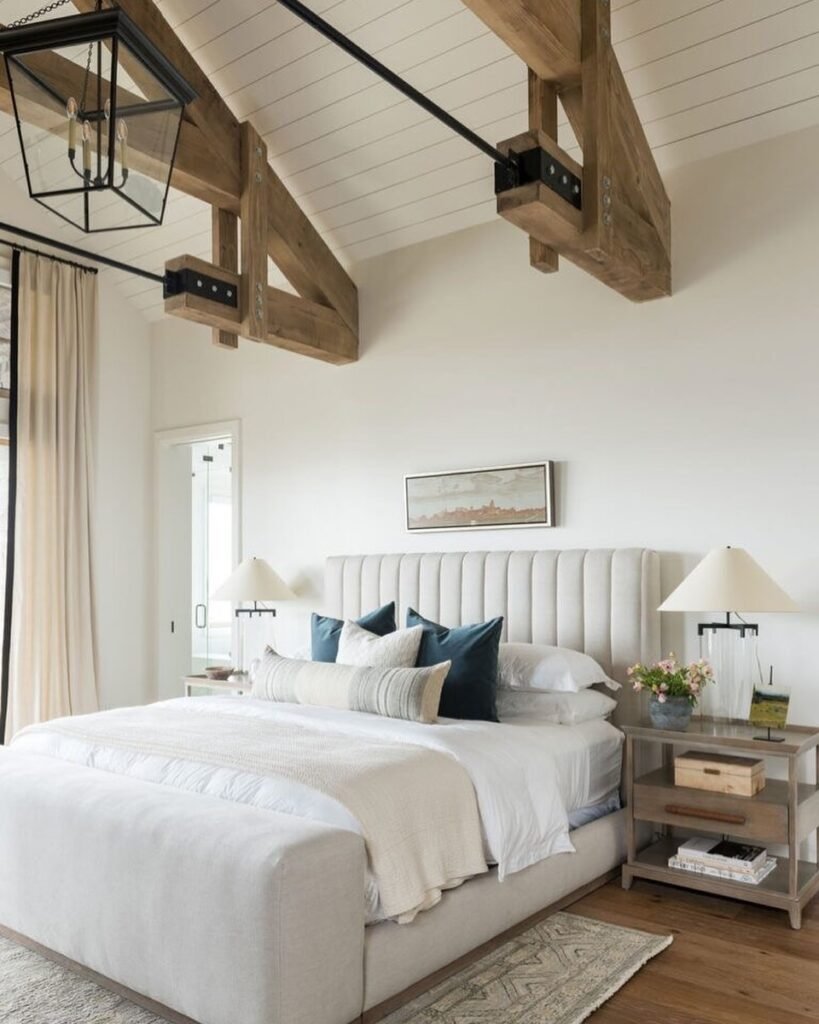
- The Bedroom Hero: Thanks to subtle yellow undertones, it’s a “cozy yet neutral” choice—perfect for creating a soothing, “so-ready-for-a-nap” atmosphere.
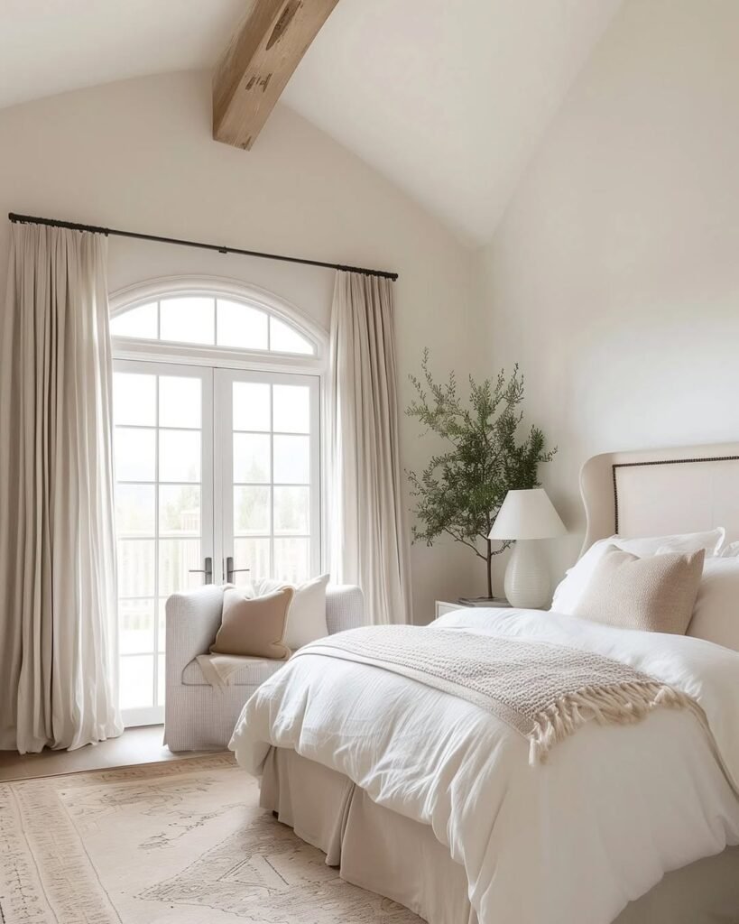
- The “Gentle Hug”: It’s all about that quiet warmth. The creamy undertones feel like a gentle hug the moment you walk into a space, making it a timeless starting point for anyone a little nervous about moving away from basic white.
It’s the Ultimate “Supportive” Backdrop
If you’re someone who loves a pop of color but is “color-shy” about painting the actual walls, Swiss Coffee is your best friend. It doesn’t compete with your decor; it acts as a clean yet inviting stage.
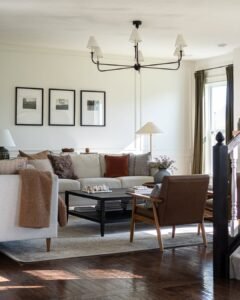
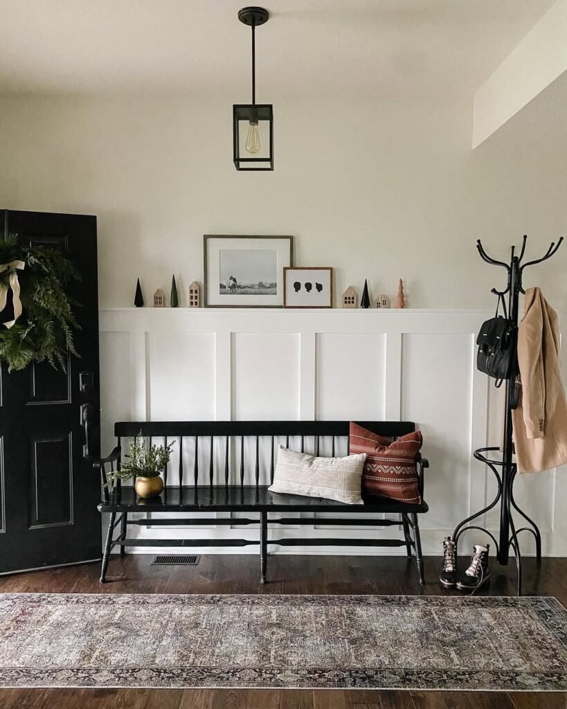
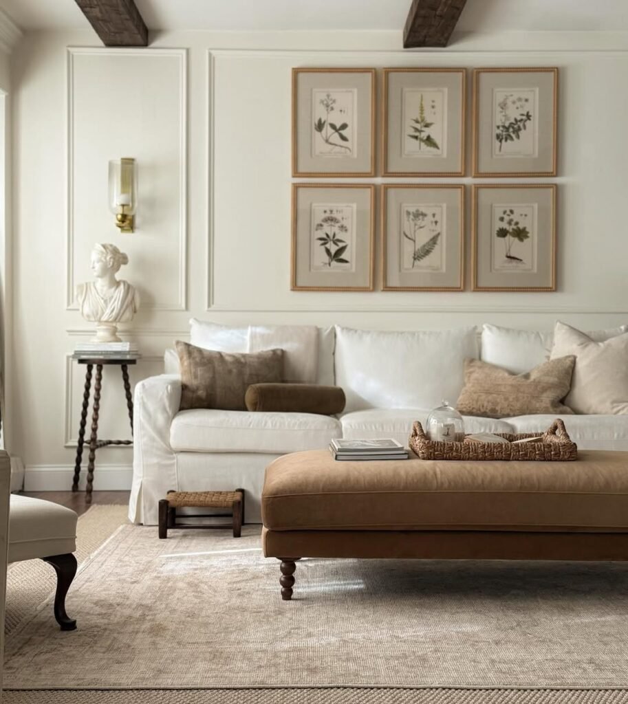
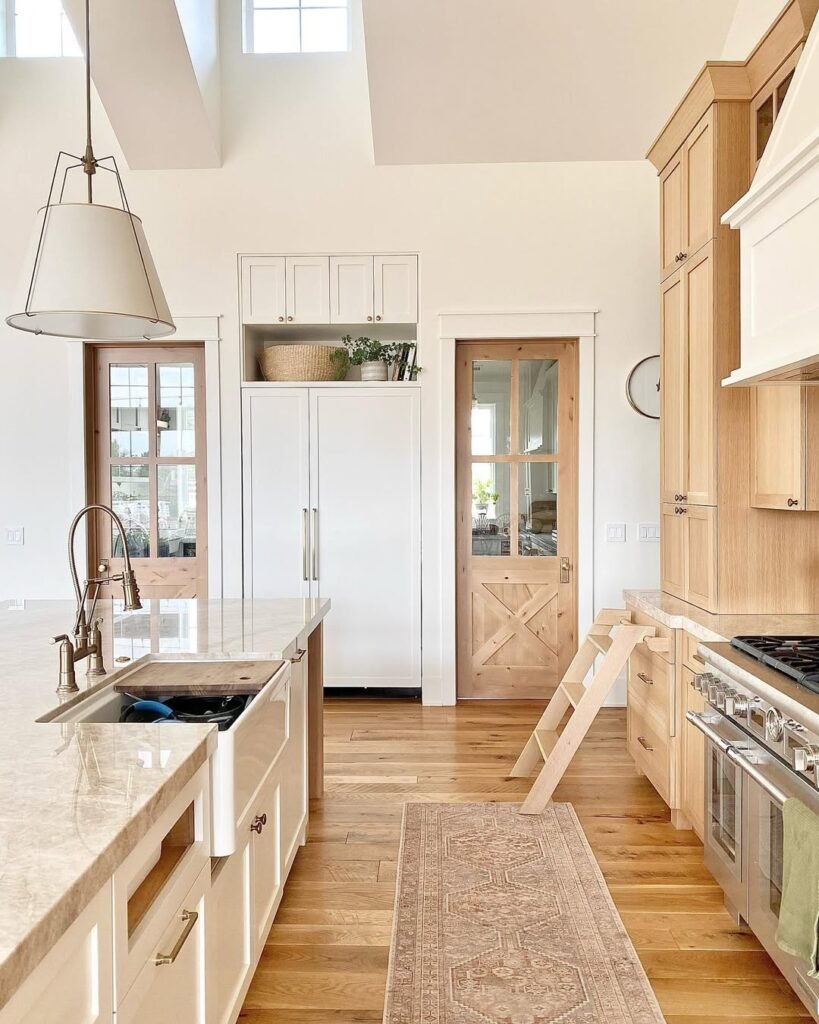
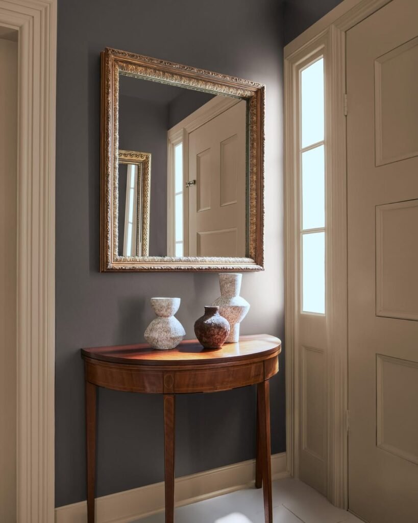
- Earth Tones’ Best Friend: When leaning into a deeper palette—think rich browns, earthy reds, or olive greens—you need a white that complements rather than competes. This milky white floods a space with softness.
- Cohesive Vibes: For a truly high-end look, carry the color across walls, ceilings, and trim. This creates an airy, intentional backdrop that works beautifully across both modern and traditional styles.
Credit: juniper.hills.farmhouse
It Brings the Warmth (Without the “Yellow”)
The biggest fear with off-whites is that they’ll end up looking like dated, dingy butter. Swiss Coffee manages to hit the “Goldilocks” zone of warmth.
- The Perfect Balance: It manages to warm a room up significantly without ever crossing the line into feeling “too yellow.”
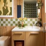
- Organic Harmony: This shade is a dream for nature-inspired spaces. It allows organic textures—like raw wood, aged metal, stone, and indoor greenery—to truly shine, creating a harmonious and lively interior.
Benjamin Moore’s Swiss Coffee vs White Dove
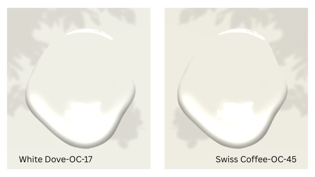
When you’re staring at two white paint swatches, it’s easy to feel like you’re overthinking it—but the difference between White Dove and Swiss Coffee is all about the “vibe.” Think of White Dove as the crisp, clean classic; it has a touch of gray in its base, which keeps it looking bright and sophisticated without ever feeling yellow. It’s the ultimate “safe” white for trim and doors.
Swiss Coffee, on the other hand, is like the warm, frothy milk on top of a latte. It has significantly more yellow and ochre undertones, making it feel much creamier and “cozier” than White Dove. If White Dove is a fresh gallery wall, Swiss Coffee is a sun-drenched breakfast nook. If your room gets a lot of cool, northern light, Swiss Coffee will help it feel less chilly, whereas White Dove might feel a bit more modern and stark.
The Cult-Favorite Whites Comparison
| Paint Color | The “Vibe” | Undertones | Best For… |
| White Dove | Crisp & Classic | Neutral Gray/Yellow | Trim, doors, and bright, modern kitchens. |
| Swiss Coffee | Creamy & Cozy | Yellow/Ochre | Living rooms and bedrooms that need a “hug.” |
| Alabaster | Soft & Balanced | Warm Beige | A true “off-white” that feels peaceful, never yellow. |
| Simply White | Clean & Crisp | Very Slight Yellow | Dark rooms that need a boost of “artificial” sunshine. |
How to Choose Your Winner:
- Check Your Light: If your room faces North (cool, blue light), Swiss Coffee will help warm it up. If it faces South (warm, golden light), White Dove will stay crisp while Swiss Coffee might start to look a bit like melted butter.
- The “Trim” Test: If you want your trim to pop, use a brighter white (like Simply White) against Swiss Coffee walls. If you want a seamless, high-end look, paint the walls, trim, and ceiling all in White Dove but in different finishes (flat on walls, semi-gloss on trim).
Best Accent Colors That Pair Perfectly With a Swiss Coffee
Pairing accent colors with Swiss Coffee is like finding the right accessories for a classic cashmere sweater—it’s all about enhancing that built-in warmth. For 2026, the palette is moving toward “Tailored Classics” and “Earthy Restoration.”
Here is your 2026-approved shopping list of accent colors to pair with a Swiss Coffee backdrop:
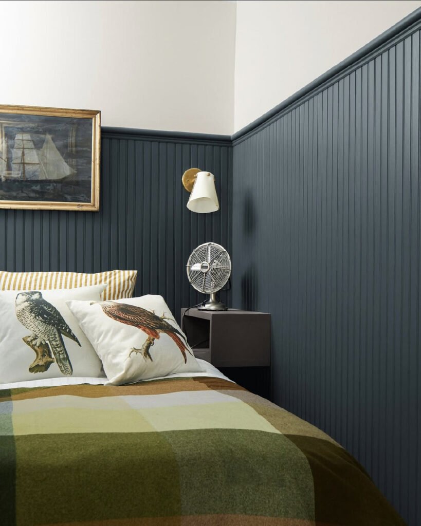
1. Silhouette (The Moody Anchor)
This is the 2026 “it” color for contrast. It’s a rich, deep charcoal with an espresso base that feels incredibly sophisticated against the creaminess of Swiss Coffee.
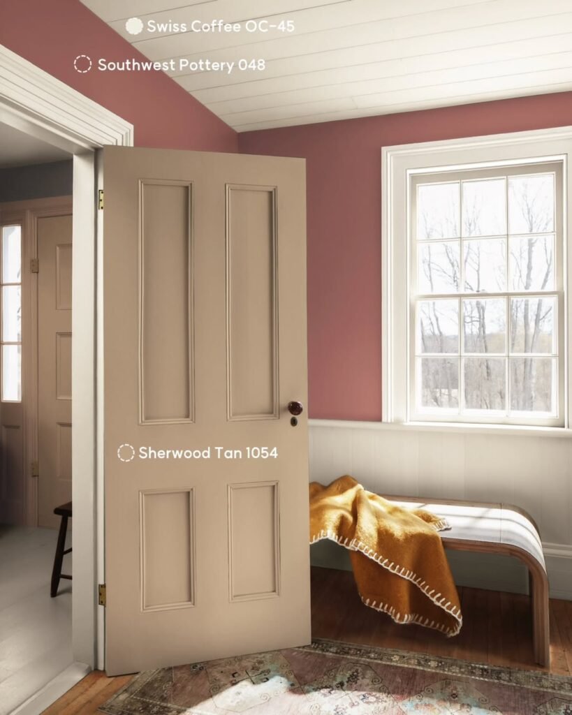
2. Southwest Pottery (The Earthy Soul)
Earthy, sun-baked reds and terracottas are making a massive comeback. This shade adds a “Mediterranean Modern” vibe that pulls out the subtle glow in Swiss Coffee walls.
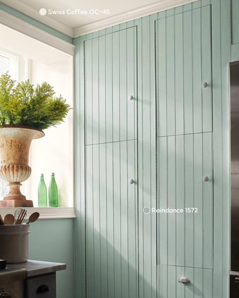
3. Raindance (The Biophilic Breath)
A soft, muted green-blue with gray undertones. This color is the ultimate “restorative” pairing, creating a spa-like atmosphere that feels fresh and organic.
4. Sherwood Tan (The New Neutral)
We’re moving away from flat beiges toward “sandy” tans with more depth. This tone-on-tone approach creates a quiet, luxe “Parisian apartment” feel.
5. Narragansett Green (The Grounded Classic)
A dark, moody teal-green that adds instant history and “weight” to a room. It’s the perfect partner for Swiss Coffee’s yellow undertones.
Pro Tip: In 2026, we’re seeing a lot of “Matte & Gloss” layering. Try painting your walls in a matte Swiss Coffee and your trim or a nearby accent piece in a high-gloss Silhouette for a look that feels intentionally designed!